If you’ve listened to local radio at all recently, you’ve likely heard the two biggest buzzwords in the industry right now: live and local.
When done right, it’s truly what can differentiate a radio station from the dozens and dozens of audio options that exist in this technology era. Add in the digital component to radio and there’s hope for the future of the medium, even if the landscape looks pretty bleak in many places. Just look through recent headlines or glance at stock prices and the problems are evident.
Many places have sacrificed employees for the good of the bottomline, which is an unfortunate reality during this transformation period. That’s why it’s important to let your audience know when you’re investing in local people and the local community. It’s not much different from many other sectors of this country as automation becomes the norm and forces companies to adjust or fold.
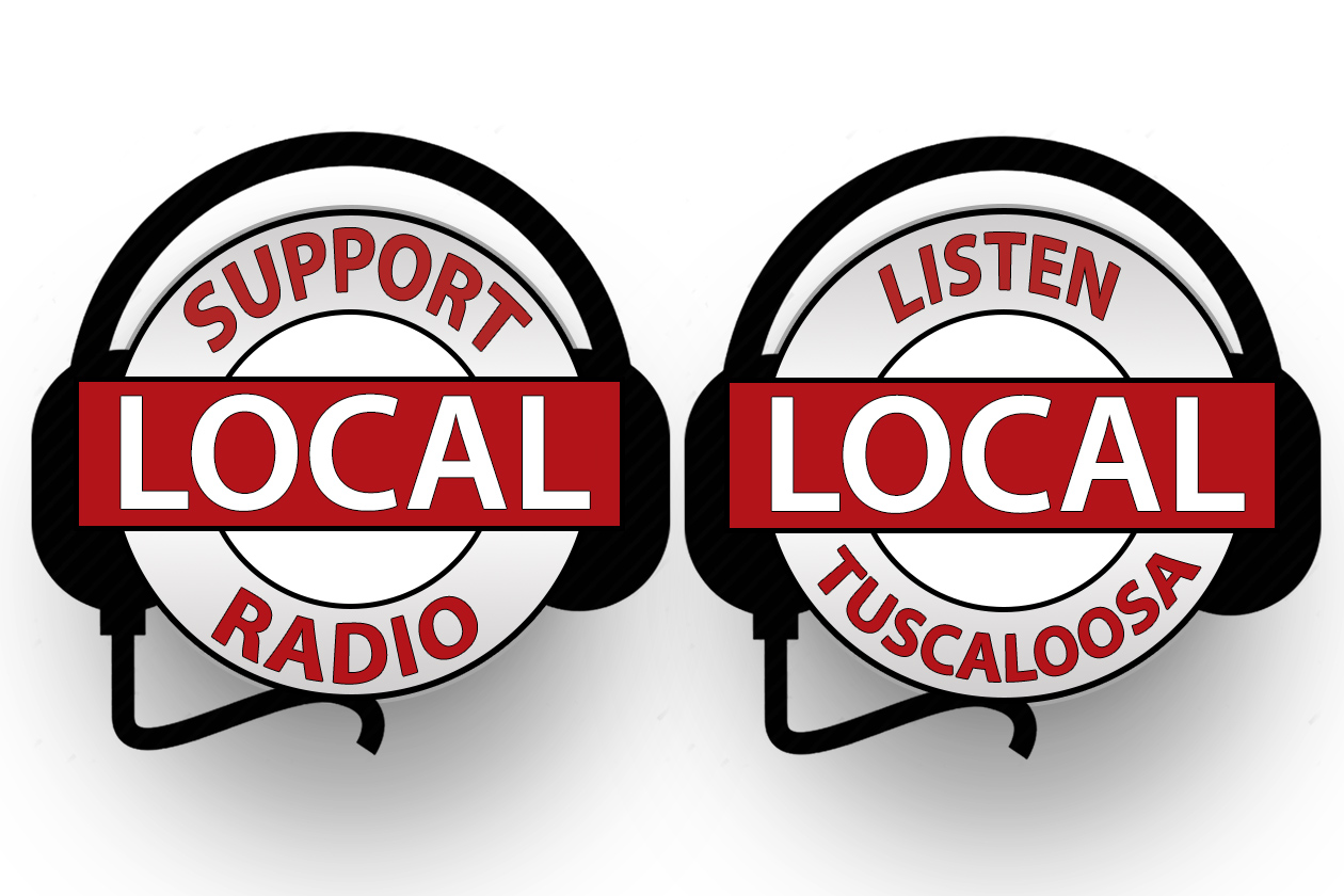
That’s where these logos come in. I was asked to put together a logo that the company could feature in marketing materials, on the website, and in emails – practically anywhere we communicate with listeners, readers, or clients. We want to drive that message home that we support the local community because it truly is a priority.
Most of my career hasn’t required much in the way of graphic design, but I’ve made it a personal focus over the last few years to develop those skills. I’ve taken on more of this work to supplement my normal day-to-day because I understand the importance of visuals (and the shift to video).
These aren’t too sophisticated but I like the way they turned out, clean and effective in delivering the message. Maybe you’ll see them if you come across our work, and hopefully there will be more like this to share in the near future.